Sunday, March 17, 2019

Font Change!!!

Hey guys!! So, if you guys have been reading all the blog posts this week, then you all know that Vale and I have been having some difficulties in choosing and deciding which fonts and colors to use for the credits and titles in our film opening. Well guess what, Vale and I have made a final decision on the fonts and colors we will implementing. We would have still been stuck in the fonts if it wasn’t for the group meetings we had in class the other day. Vales group had told her that we should use and do something similar to the movie Monster in Law’s. When Vale told me I immediately went to go check out the opening credits and I was so happy because it was exactly what we wanted with our opening credits. Let me show you guys how it looks in the movie. 
                                                 
                                                 
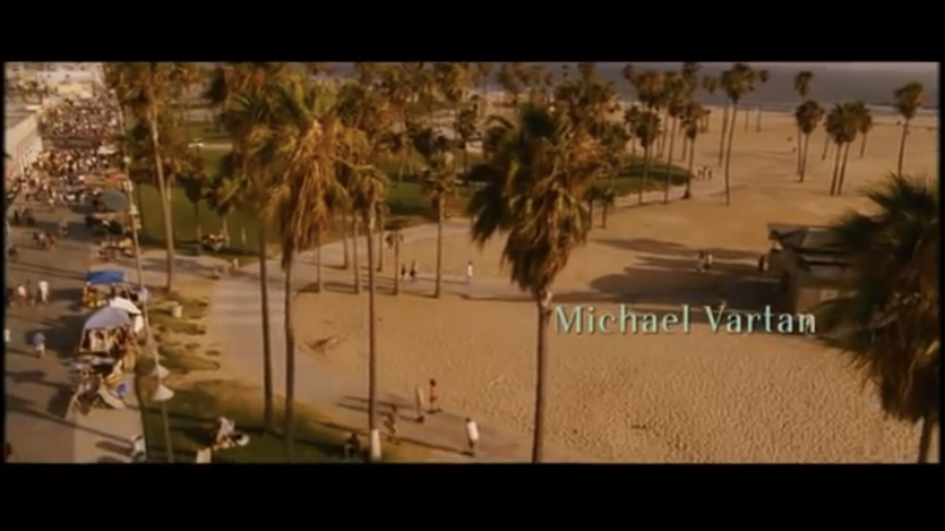
 The font choice we have finally decided to use is High Society because it is what looks closest to the font used in Monster in Law’s. I already showed you how High Society works but if you guys didn’t see that blog, this is how the font looks. 
                                                            
Now comes the color aspect that we want to use for the font. So after watching Monster in Law’s many times, we decided that we wanted to use warm hues. We decided that we were going to switch our original colors, blue and yellow, to turquoise and orange. Here are the colors that we will be focusing on using for the credits and titles 
                                             
We decided we wanted to use turquoise because it gives off a calm, relaxing, and clear mood and orange because it gives off a happy and adventurous feeling. Well that’s all for today, I will continue to keep you guys updated in everything going on. Talk to you guys soon!!

No comments:

Post a Comment